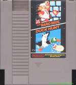
Depends on what year the games were made.
If you look at initial releases, SMB, DuckHunt, ExciteBike, and others you'll notice the actual graphics were shown as the cartridge art because it was the leading edge in graphic capability.


As the NES aged, cover art began to become less actual graphics, and more logos and art.


But since NS is a graphic marvel for the engine it is on, it seems more fitting that if it were released on the NES, it would have used actual ingame pixelated glory to show off its superior graphics. Other wise, it would have been simply the logo art.
If this was an attempt to show it as an actual sample of Graphics, it's still too complex. If it is simple cartridge logo art, why even pixelate the logo?
EDIT: And by the design of the sticker below the log, this leads to suggest this was an older cartridge, and logo art was probably not used. Therefore, it would be more fitting to place actual in game graphics on the game.
Now that I have delved into a simple gag way too far, I shall stop.